
 bulletman
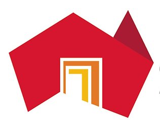
Would you believe this design cost the Taxpayers $1.4 MILLION DOLLARS, origami gone wrong.
It doesn't really promote the state, sort of looks like an origami picture of Oz all be it without Tassie
5 Answers
 ROMOS
ROMOS
I wouldn't say it encourages me but I can see what it's saying, looks like it was the same guys who designed the London Olympic logo.
![]()
| 13 years ago. Rating: 4 | |
Funny you would say that, Romos, it was done by an Aussie who has an Advertising Agency in London.
 lambshank
 Colleen
No. It doesn't say Australia to me. Looks more Oriental.
| 13 years ago. Rating: 3 | |
How did i know you would say something like that, now don't you get your back up, i was only kidding. I do agree with you, it not the best, it has caused a bit of an uproar as Tasmania has been left off.
 pythonlover
Sorry Bulletman but i have to say that logo is plain and ugly.It looks more like an advertising logo for a home loan company.
| 13 years ago. Rating: 3 | |
I quite agree, Pyth - most South Australians have said, the money spent would have been better building more Dams, only problem with that is you need rain to fill them--- their opinion on the logo -- CRAP.
 hector5559


Top contributors in Uncategorized category
Unanswered Questions
Nhà Cái Five88
Answers: 0
Views: 15
Rating: 0
Preventive Maintenance Keeps Fuel Systems Running Smoothly
Answers: 0
Views: 21
Rating: 0
789Club – Thương Hiệu Game Đổi Thưởng Được Nhiều Người Chơi Tin Chọn
Answers: 0
Views: 20
Rating: 0
AW8
Answers: 0
Views: 19
Rating: 0
cesmetentepergola1
Answers: 0
Views: 21
Rating: 0
Câu Cá Đà Nẵng
Answers: 0
Views: 17
Rating: 0
SẠC GIÁ "HỌC SINH" CHẤT LƯỢNG
Answers: 0
Views: 18
Rating: 0
Nội Thất Z
> More questions...
Answers: 0
Views: 19
Rating: 0